
PSA Poster
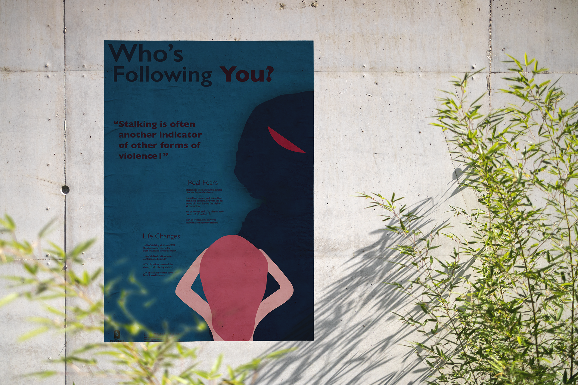
Dimensions: 11x17"
This Project deals with creating a PSA poster that is centered on the topic of stalking. The creative goal was to establish a visual system with the ability to convey an intense message. To do so dark colors accompanied with illustrative imagery were the visual tools to complete this. Blue sets the very dangerous and dark tone for the overall poster while red indicates alterness as well as provide visual contrast.The illustration is styled after the icon sign type from semiotics. This was to style the poster similar to warning signs like the stop sign, but with more contextual detail and information. A pain point with this project was trying to figure out how to design for an intense/sensitive topic without being offensive.
Imogen Cunningham Brochure
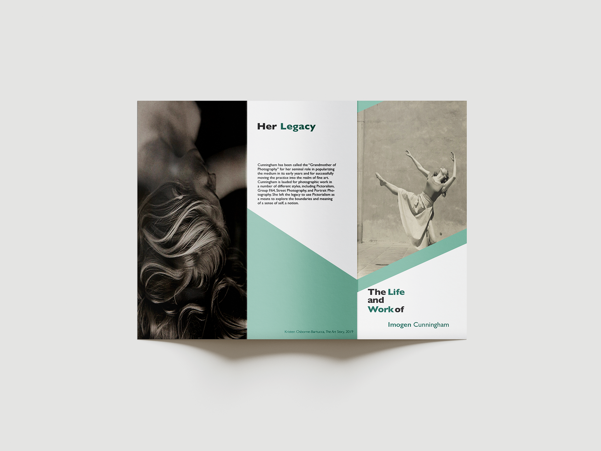
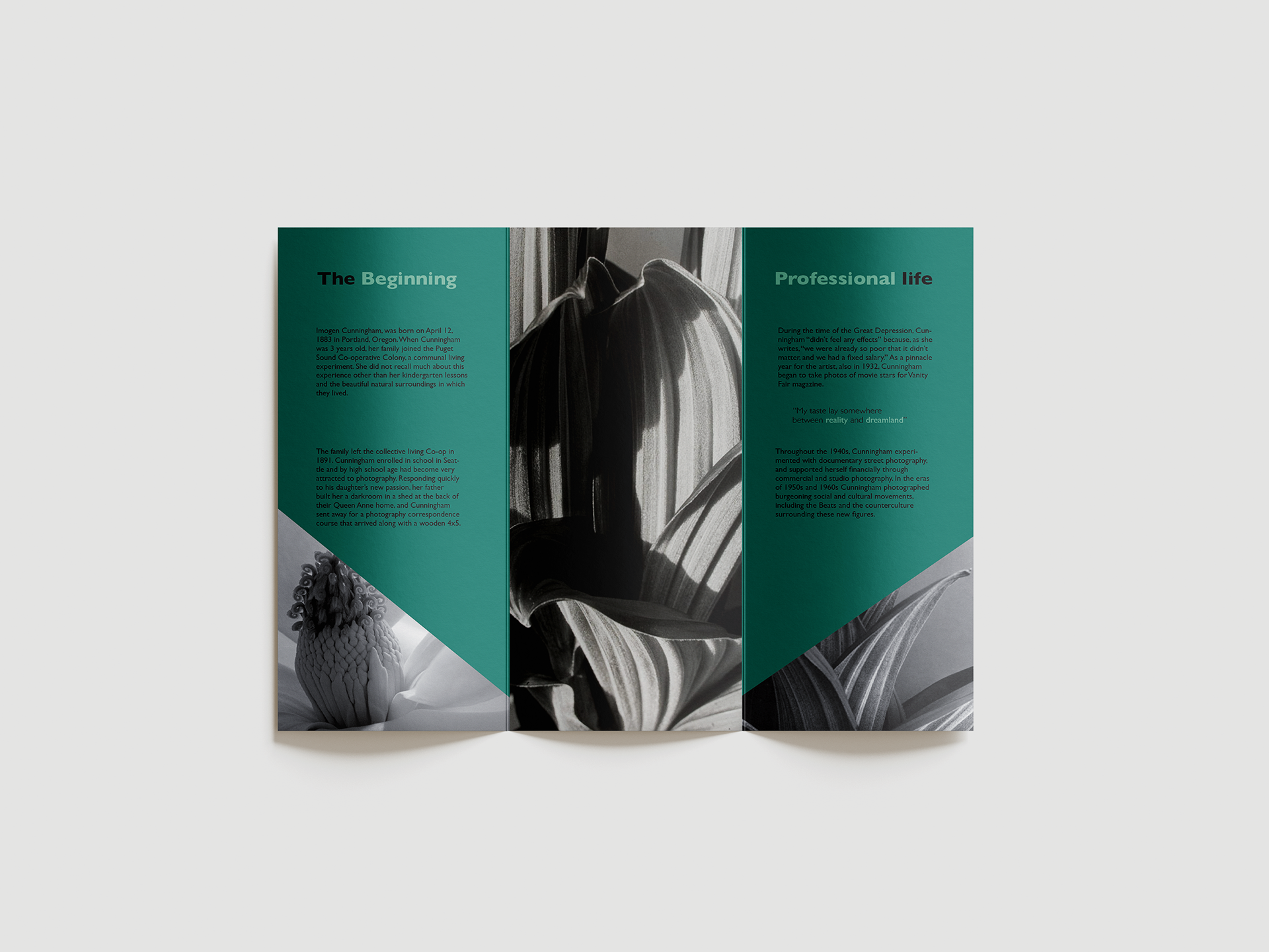
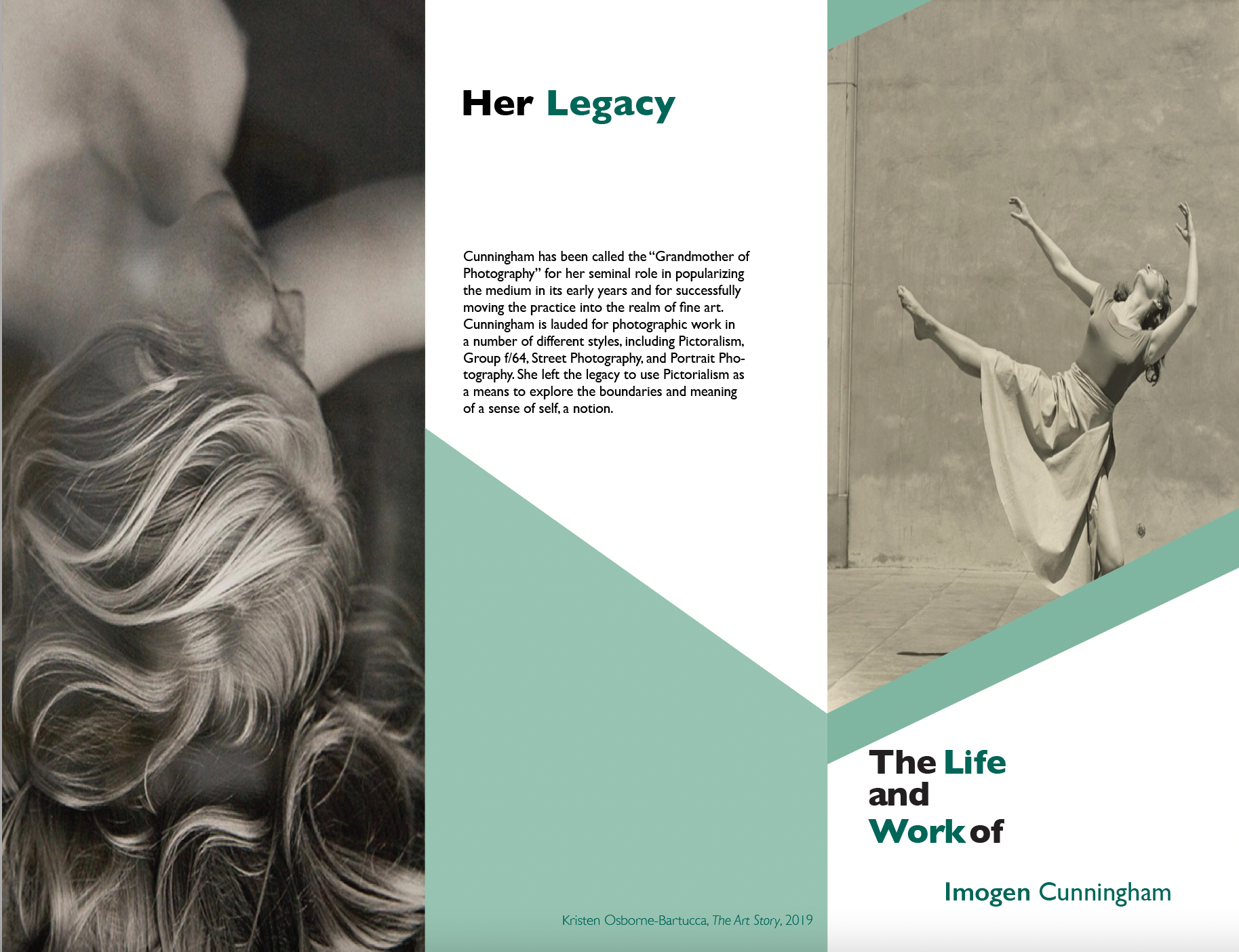
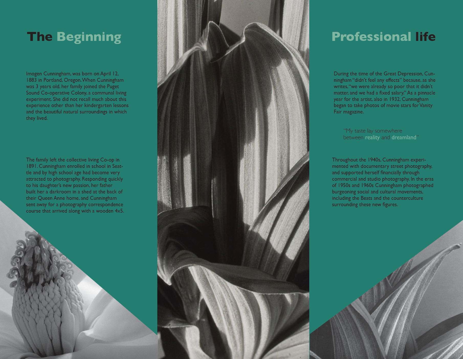
Dimensions: 8.5x11"
This project features a brochure that promotes famous photographer Imogen Cunningham. The objective was to create an effective design with appealing elements which included the artist's photographs and typography while having done so on a condensed layout. Since Cunningham was mainly a nature photographer that captured humans and vegetation as subjects a green color palate was incorporated to embody nature. The color palette had the most optimized use by emphasizing certain headings or phrasings to grab the readers attention. A dilemma was shifting through Cuuningham's work and finding the best pieces that represented her as an artist while including aspects of her journey.
Tuck Everlasting Book Re-Design
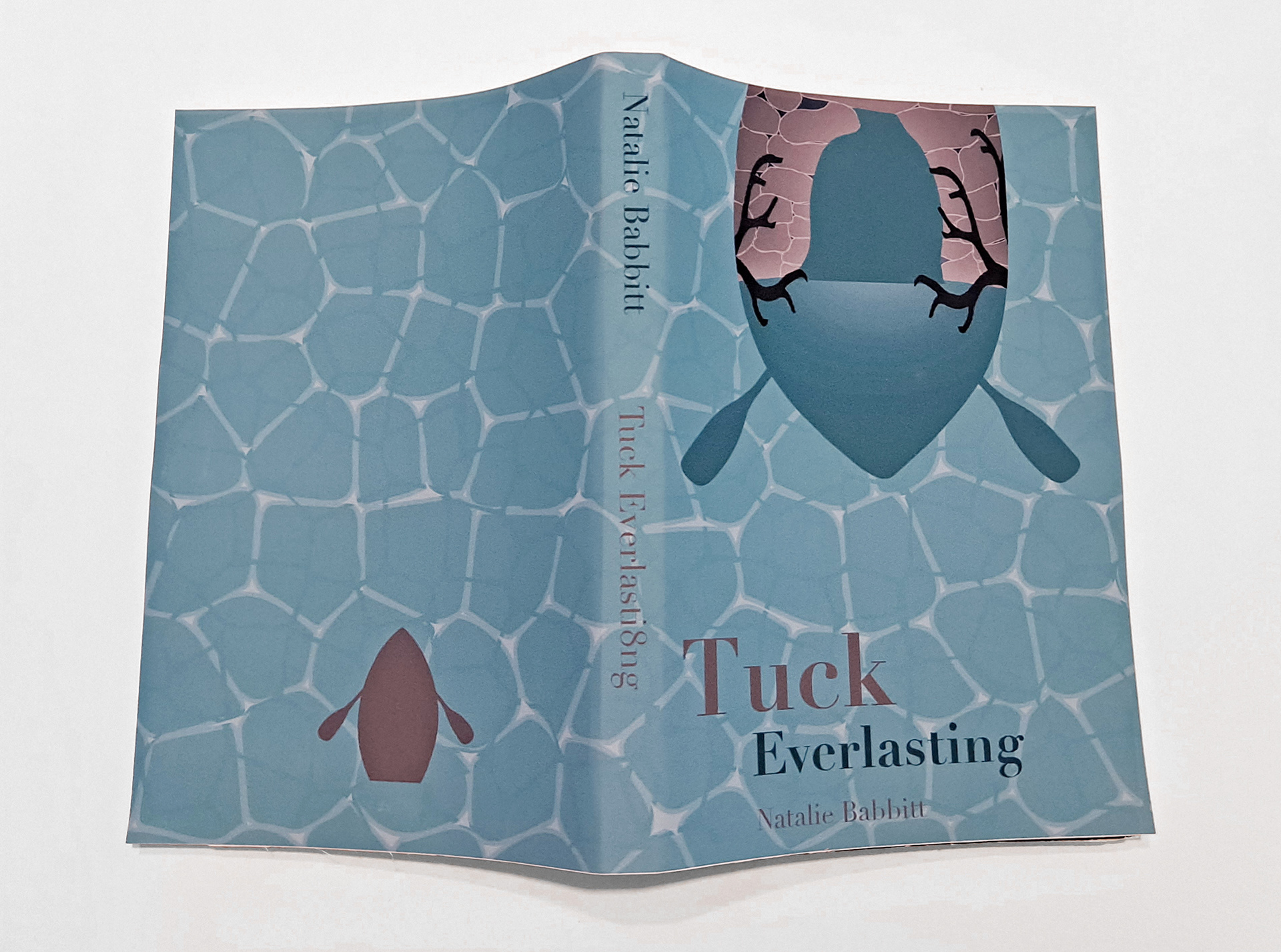
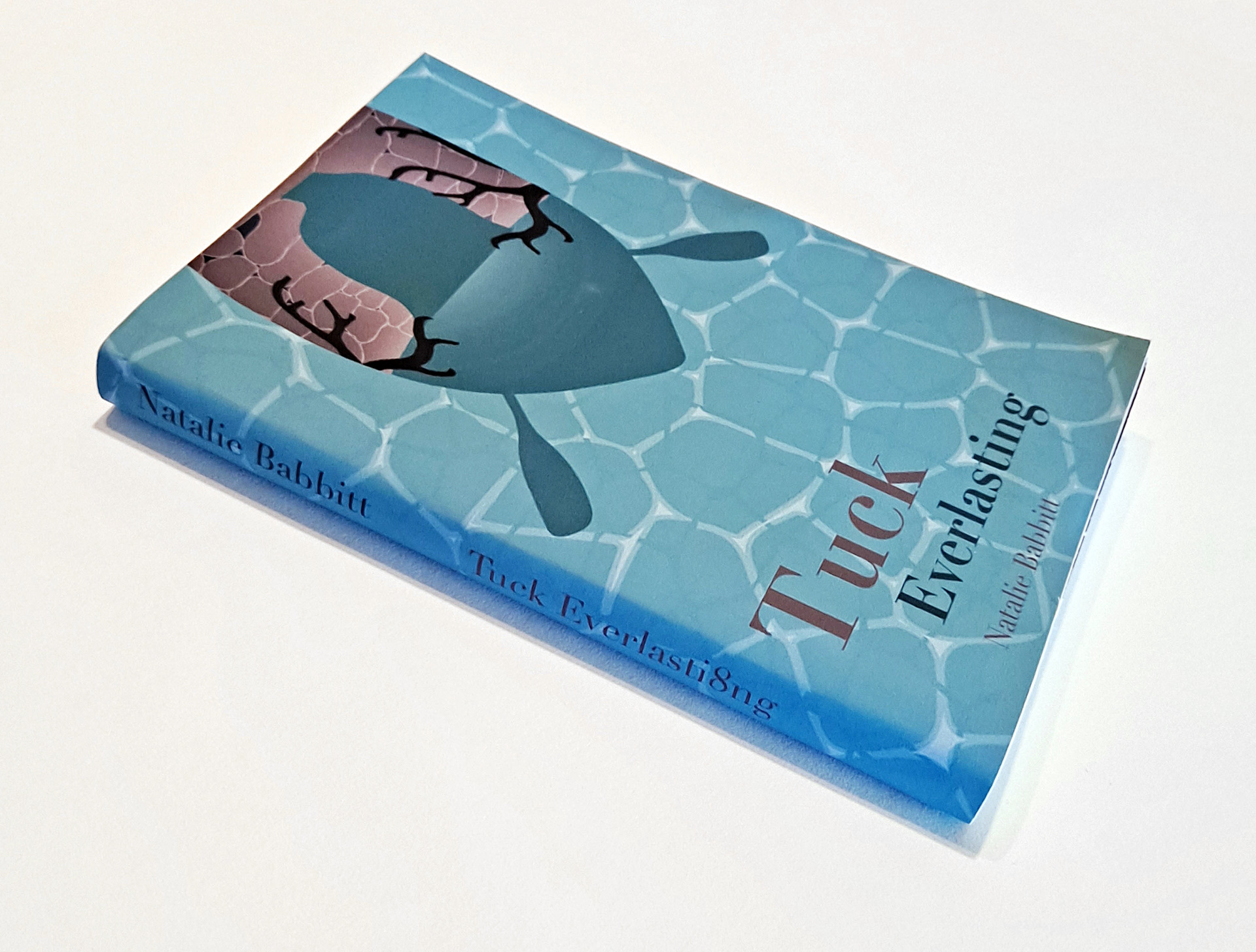
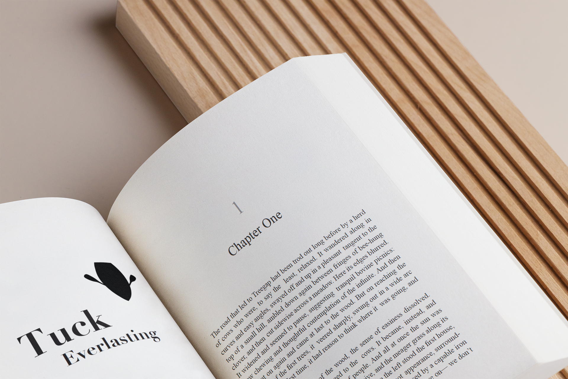
Dimensions: 5.5x8.25"
This project features a redesigned cover for the book Tuck Everlasting. Through page layouts, color application, and typography the proficient skills needed for publishing was demonstrated. The design was influenced by certain symbolic aspects that were in the book such as the boat, water, and a depiction of a spring. The cover was designed with the spring inside the boat for efficiency of space and to create visual interest. A teal and brownish-grey color palette was chosen because teal correlates with the concept of water while brownish-grey is associated with earth and stone. Green could have been been incorporated, but that has been overused with nature themed designs in past works. A challenge was producing a redesign that encompassed the core themes or elements of the book.