
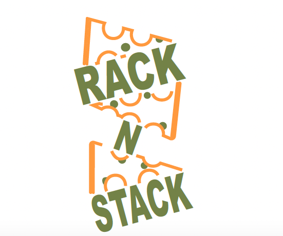
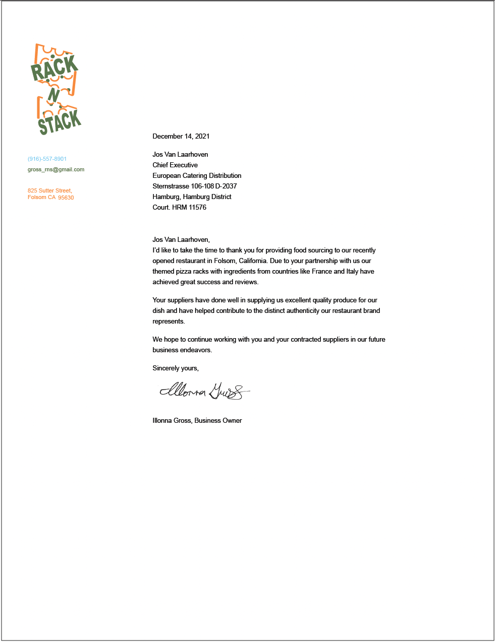
RAck N Stack Restaurant
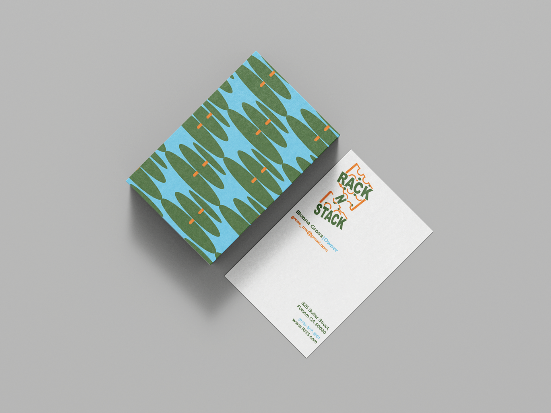
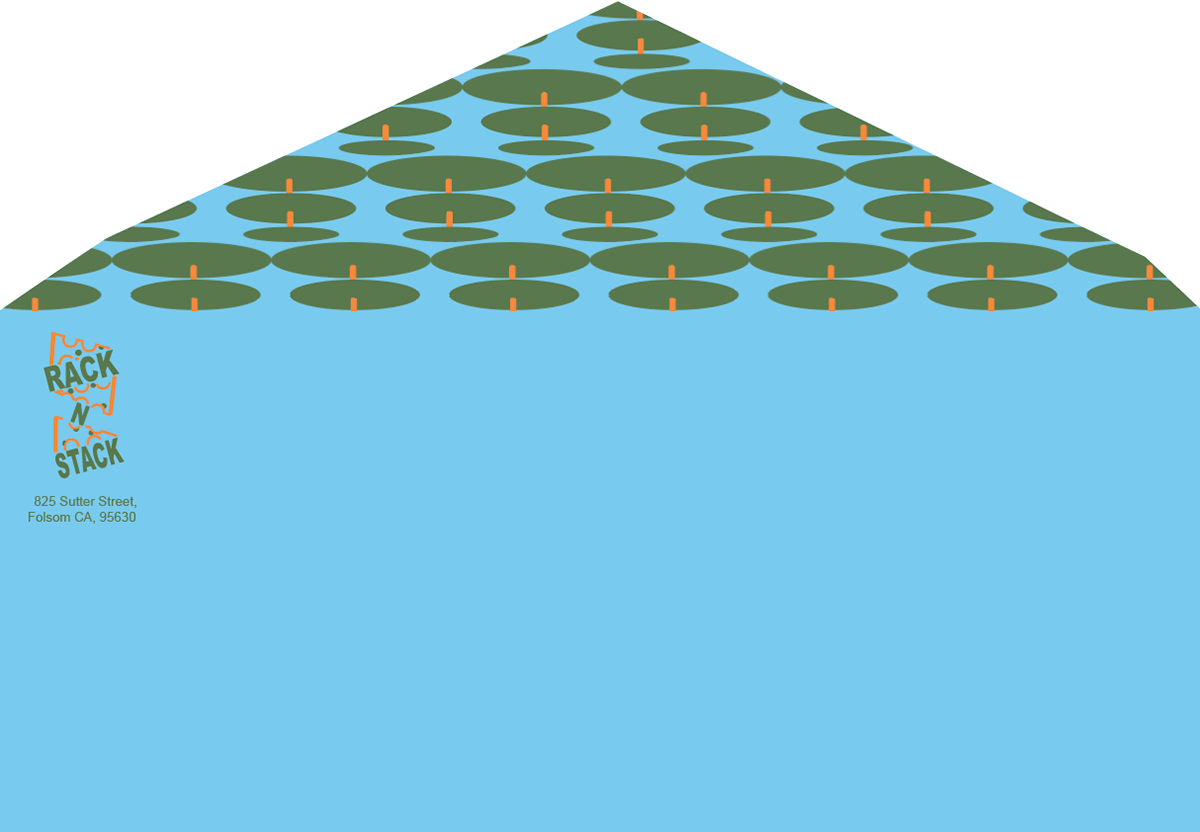
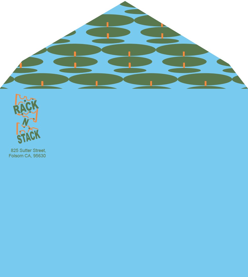
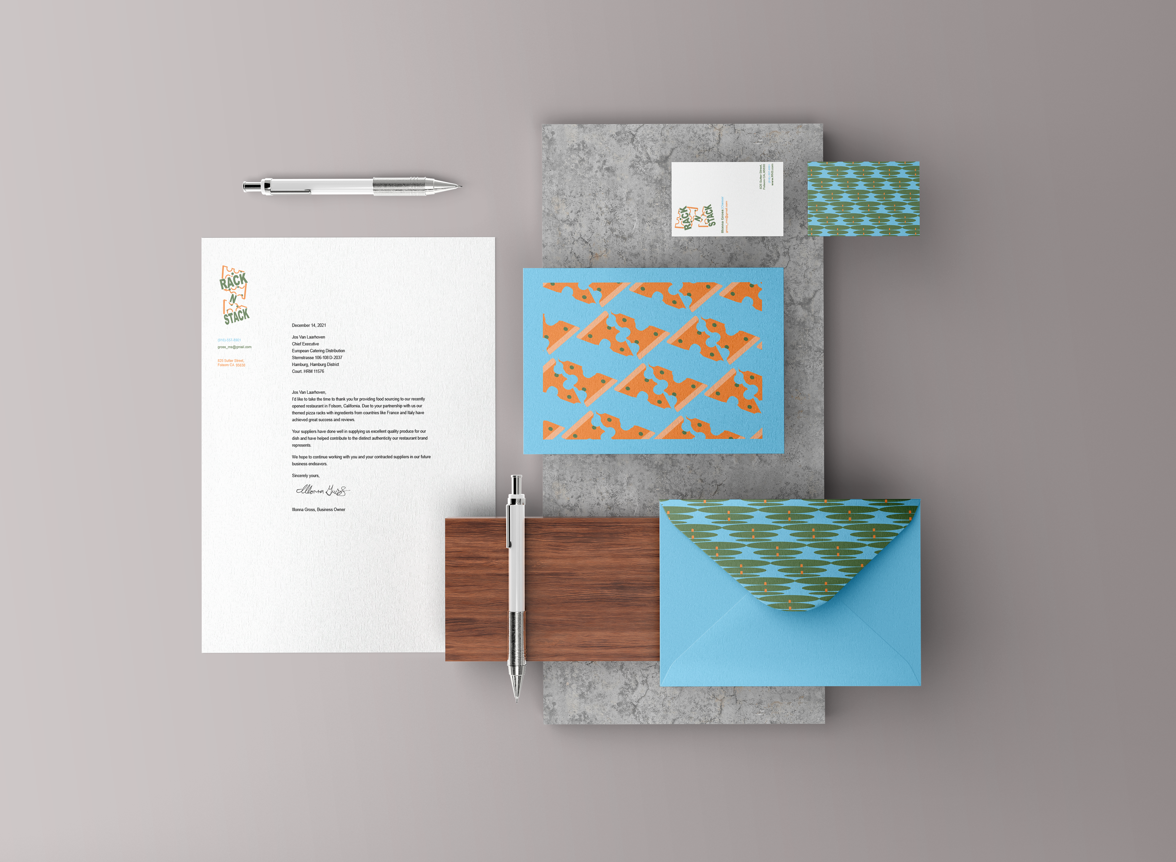
Dimensions: business letter- 8.5x11" business card- 2.5x3" long envelope- 9.5x4.13" short envelope- 5.76x4.38" mailer- 5.5x4.38"
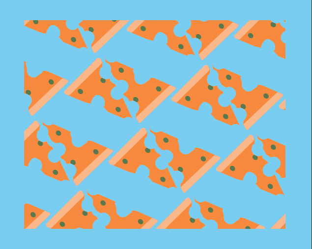
This Project deals with creating a branding system tailored for a restaurant. The focus was to showcase the restaurant's unique modern personality and atmosphere through color application, logo design, and various graphic elements. Given that this was a pizza restaurant that severed its pizza on racks visual representations included pizza that was designed to look stacked or vectored racks. For the color palette there was a push to do something modern and unique to complement the theme. Orange stands out while green stabilizes and fits well with pizzas traditional color palette as a dish. Light blue assists in creating more of a modern flair as it is not used typically for businesses like these. An ongoing challenge was creating a design system for a slightly unconventional idea or concept.
FNEM Campaign
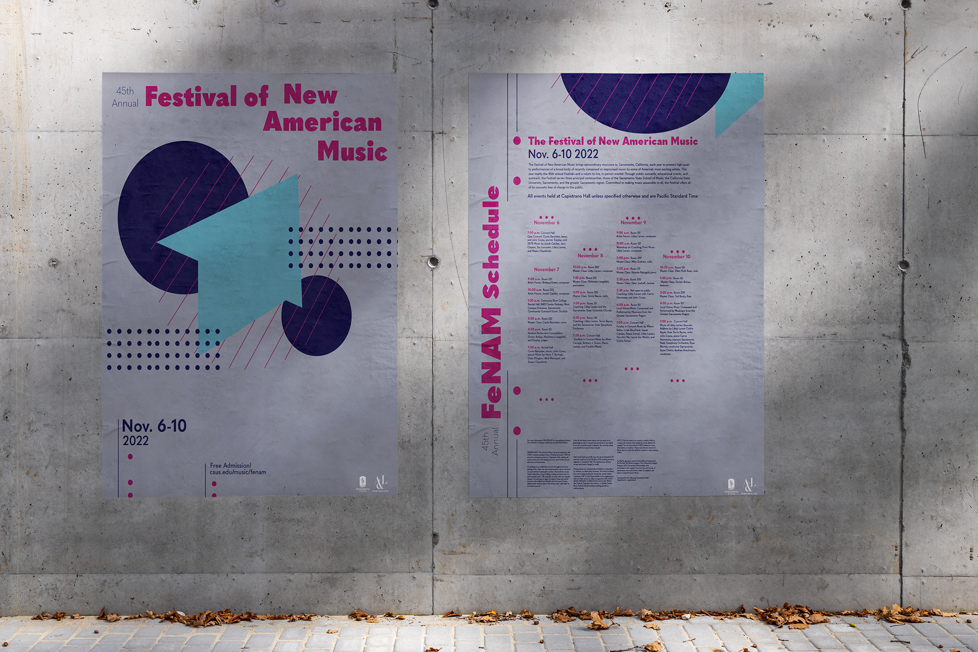
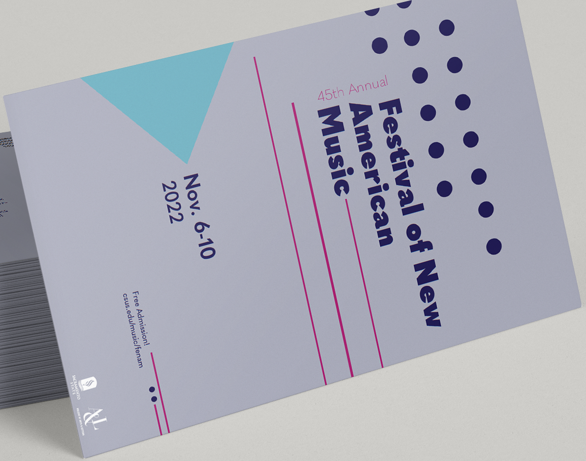
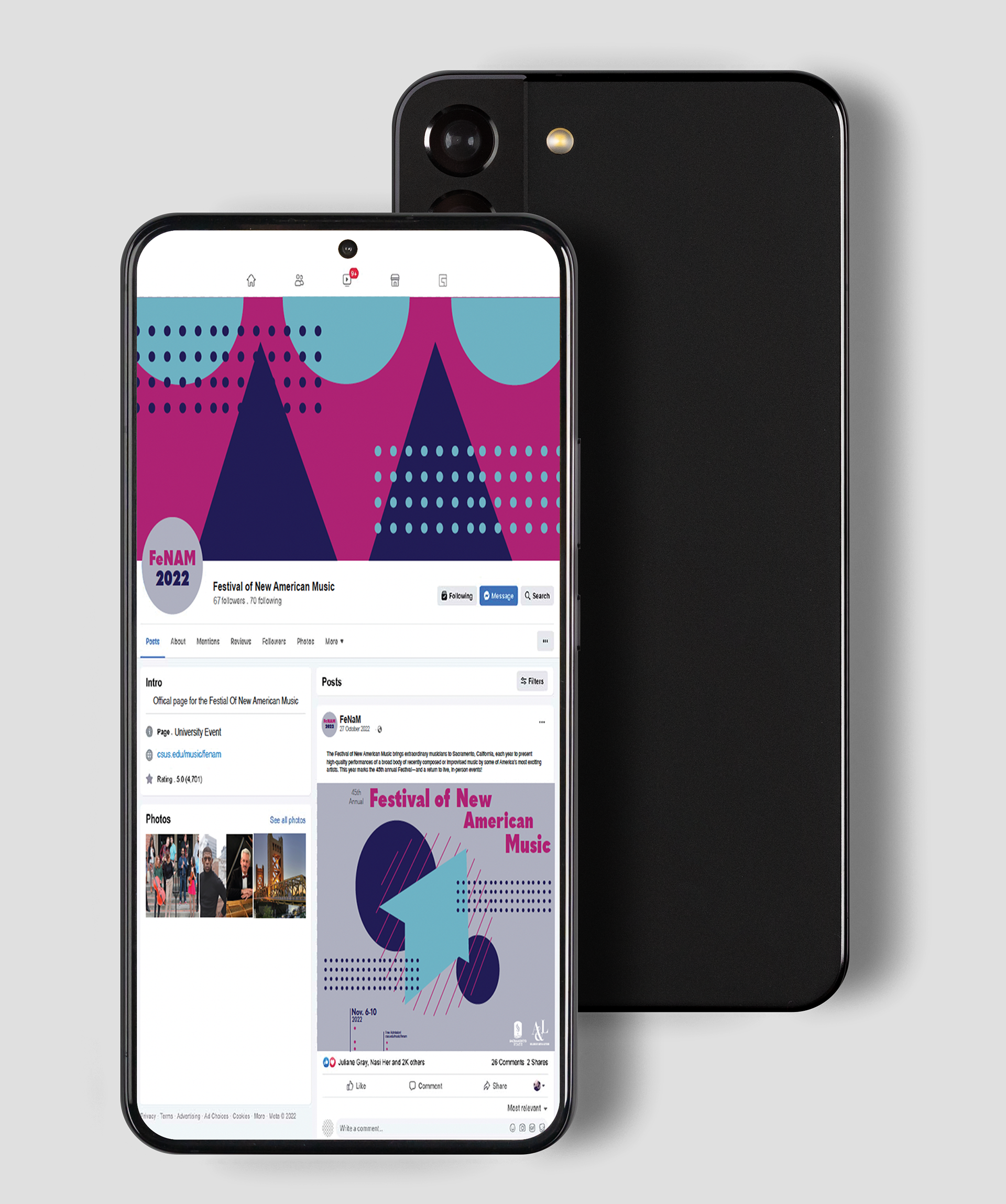
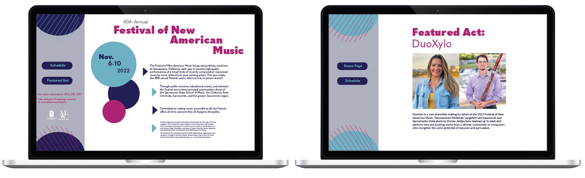
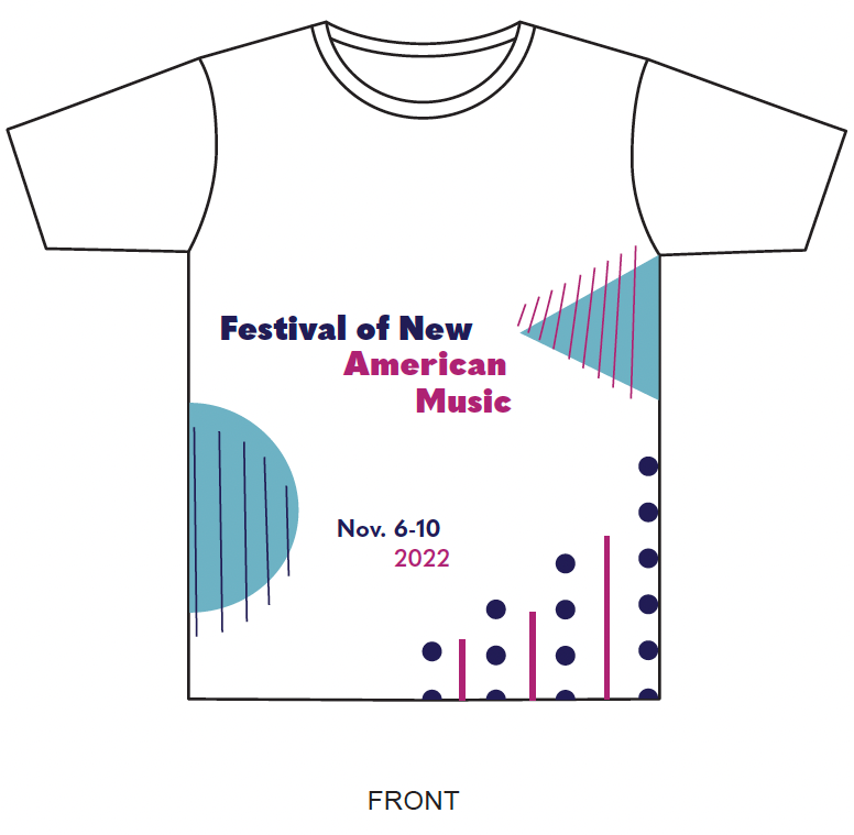
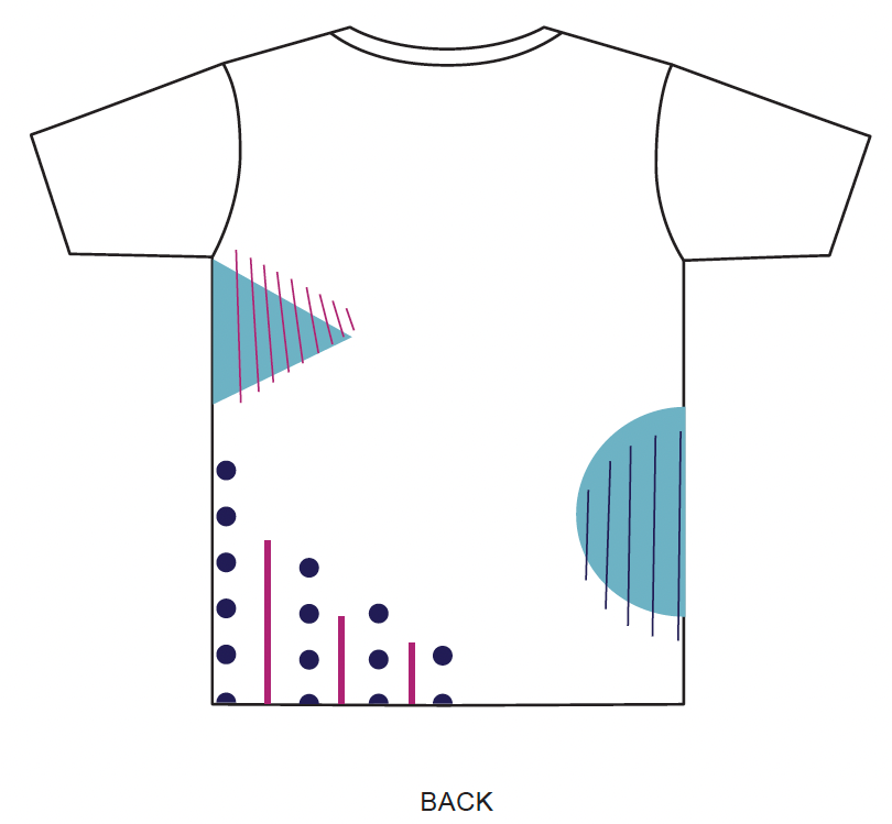
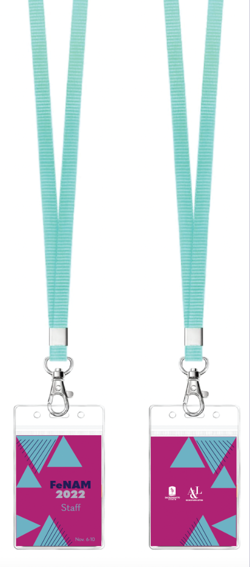
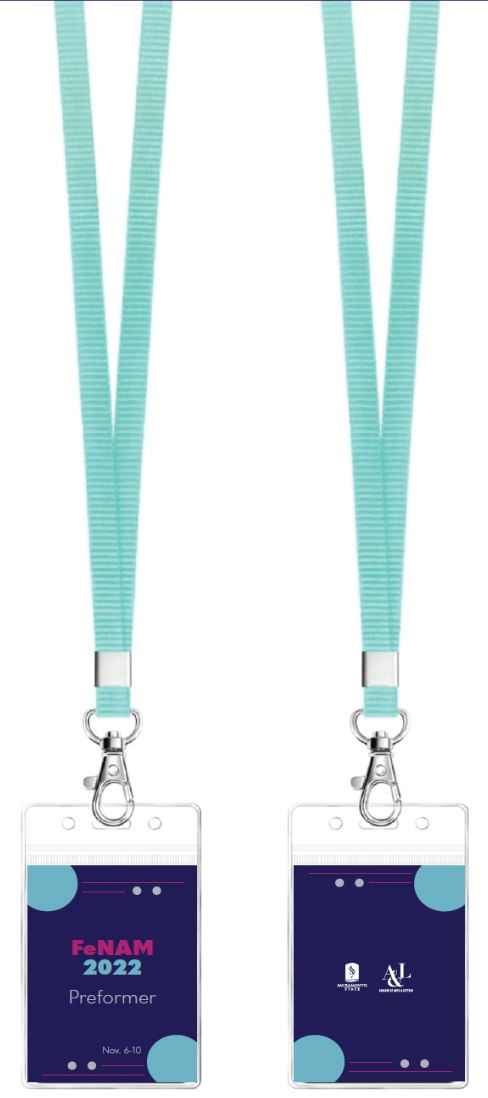
Dimensions: poster- 16x20" lanyard- 2.5x3.5" postcard- 6x9" website-1512x982px
This project features a visual system for a campaign called The Festival of New American Music. It showcases a well designed system and the different forms it was applied to. The visual system uses a bunch of lines, dotes, and shapes to capture the abstract nature of music. Also incorporated a fun and dynamic color scheme that compliments the abstract imagery and creates an eye catching contrasts amongst these pieces as well. A challenge during this process was using the visual elements in similar, but non repetitive manner.
Sac State 75th Anniversary
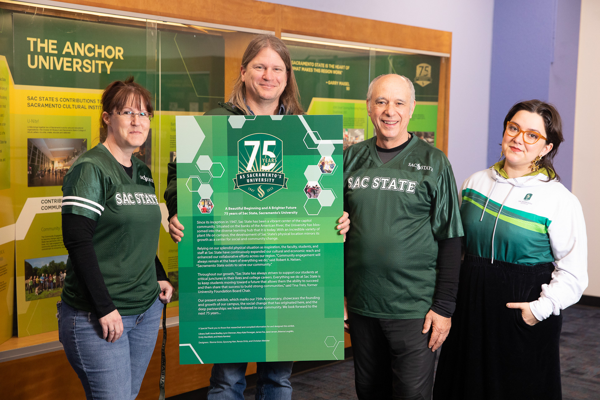
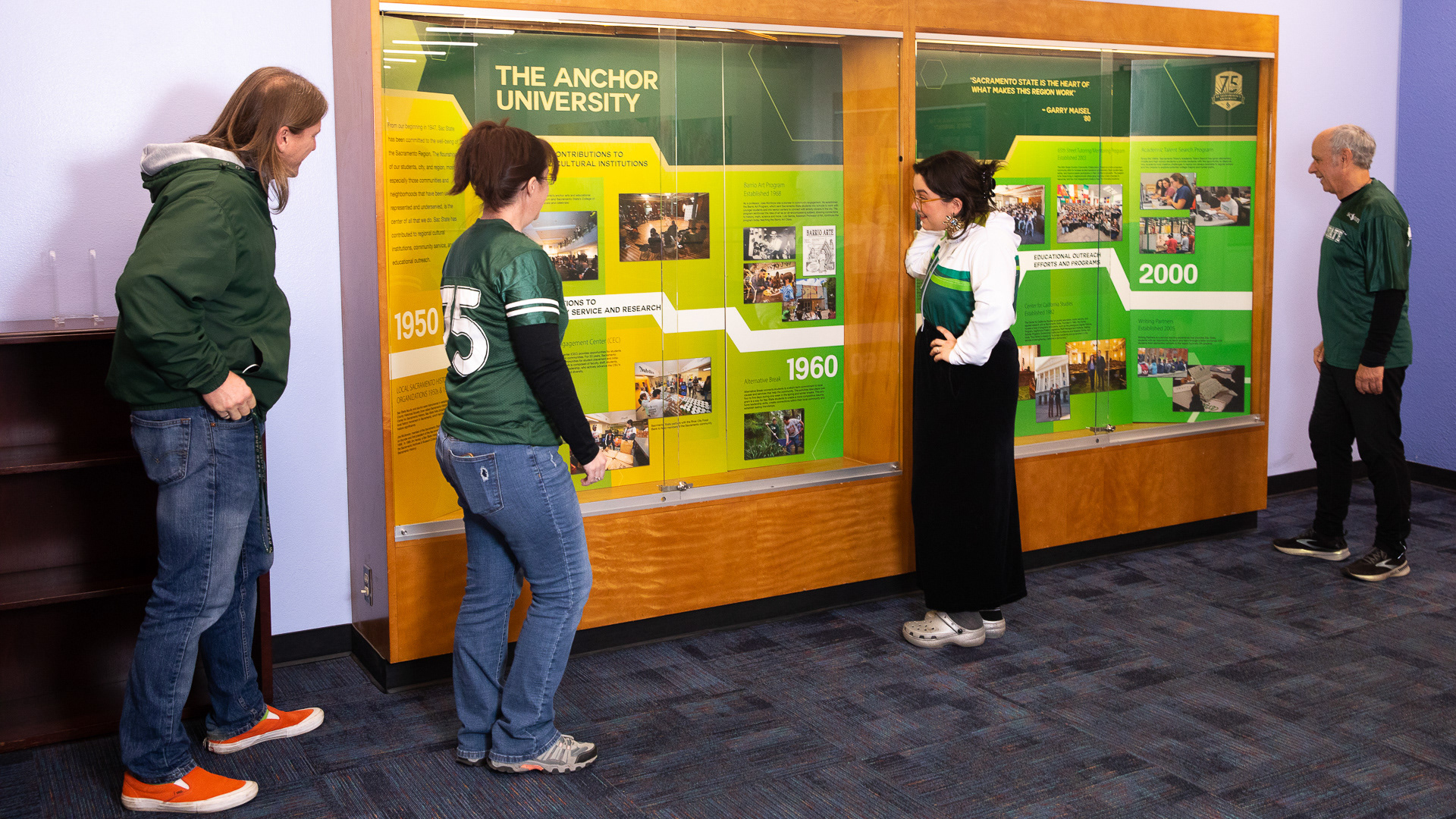
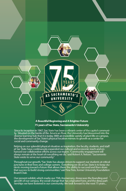
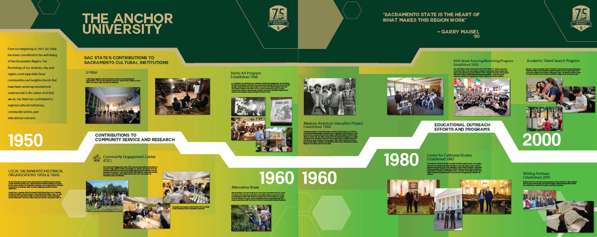
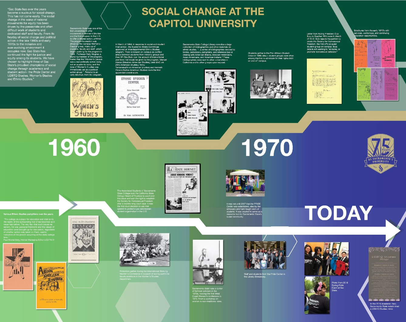
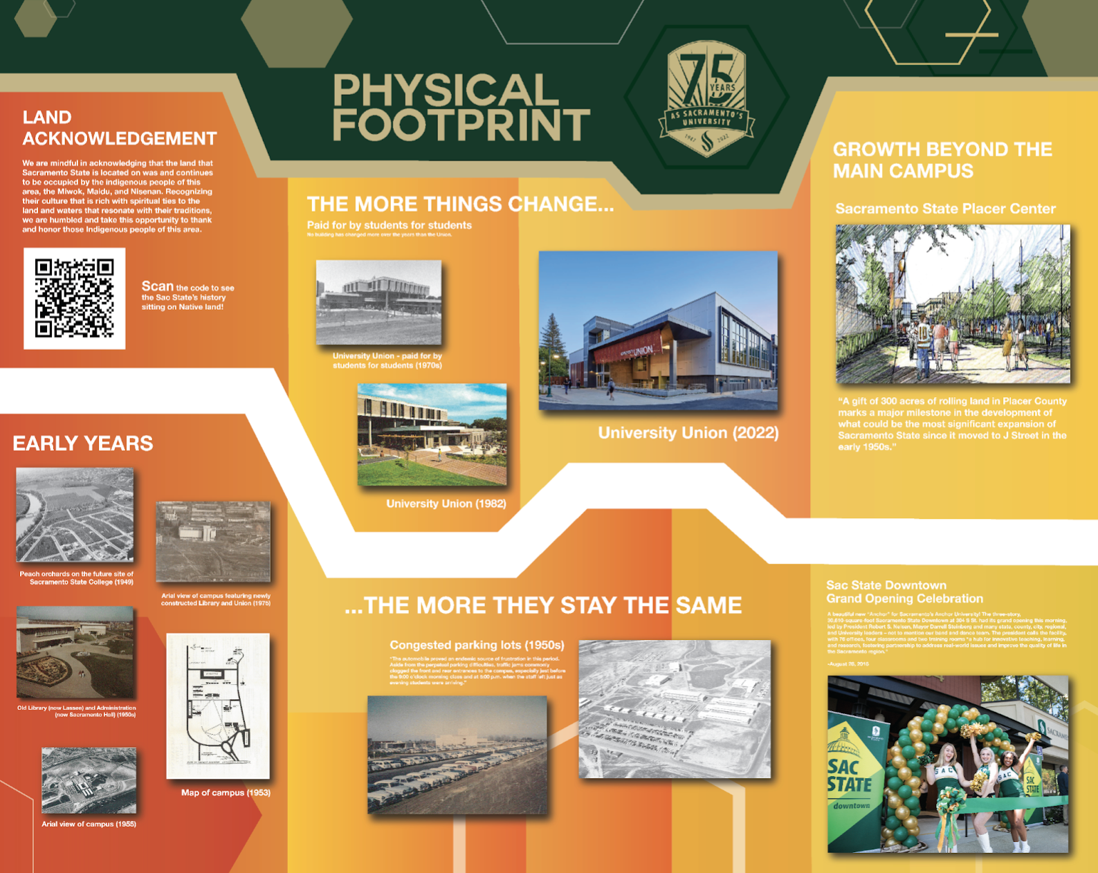
Dimensions: panel one- 2'x3' panel two- 2'x4' panel three- 2'x4' panel four-2'x4'
This group project features a creative system created for an exhibit showcased on the second story of the library during Sacramento States 75th Anniversary in 2023. The main goal was to create a unified system in the form of an exhibit that showed Sac States history. The basis for the design stemmed from the University's established brand guidelines. Brand elements such as hexagons and color palettes which were combined with a gradient overlay were used to produce all four panels. My specific contribution was designing the panel with the 75th logo in the center. This panel was the introductory one the audience would view first so the initiative was to make it stand out, but be cohesive with the rest of the panels. The logo was enlarged since it represent the key event itself and was surrounded by the hexagons because it was a well know visual elements from the University's brand guidelines and previous promotion/event material. The color used was monochromatic to make it stand out from the other panels as well as not overuse to much color. Some pain points were designing with a large format and organizing historical information into an aesthetic design.